
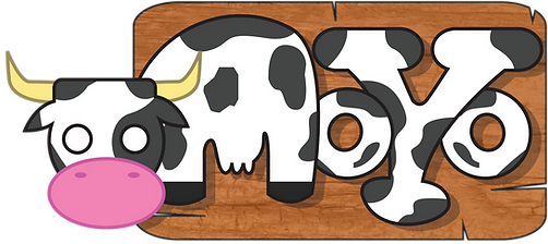
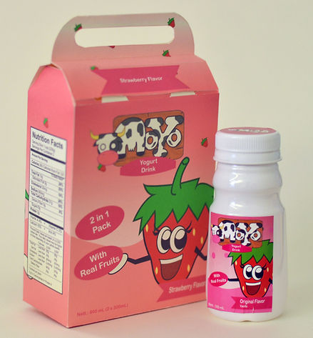
Moyo is a project where I did branding, packaging design, product design, mascots and ads design. Moyo is a yoghurt brand. Targeted for kids and teenagers. Use of mascot is to attract children to colorful characters, in hopes to interact with kids so that they could understand the content of the product such vitamins & nutritient.
Reason for using a cow and some other fruits is to give target audience image of what is the flavour of the yogurt.
Most of the work are vector related, because target audiences are children and teenagers, they comprehend cartoons more than pictures/photographs. Another reason is to make it playful too
Advertisement posters are made in series to make stories for each character and make audiences know what kind of "person" the characters are and what it represent to each flavour.
Type: Branding, Packaging, & Mascot design
Size: A3 Poster
moyo

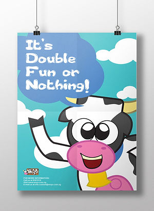
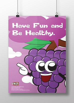
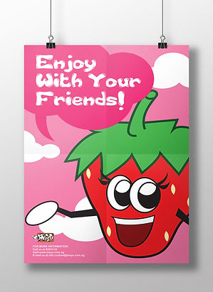

3 characters are made it through process of advertising and packaging design, but nonetheless other 2 still has their role someday and they all have their own name:
-
Moyo the Cow, represent vanilla flavor
-
Stwabewy, the refreshing
-
Gwape, the supportive
-
Babana, happy buddy
-
Chewwy, fresh twins